How To Select The Best Fonts For Your Website
Posted on
What is the main function of the text on your website? To be read.
And what makes text more or less readable? Typography.
Typography - or your web font - has a huge impact on how visitors perceive your ecommerce store. Pick the right font, and you’re on your way to creating a compelling and beautiful site that provides an enjoyable shopping experience for your visitors. Choose the wrong font, and you fail to create focused content and clear call to actions.
Web fonts play a key role in communicating your brand image to your customers, and the right font will give your store a more professional appearance. Through your choice of font, you can convey a particular tone or mood that reinforces your brand identity and character. An appropriate web font is vital to the success of your ecommerce store.
Web fonts vs Desktop Fonts
The development of web fonts was a huge milestone in web design. Originally, designers were limited to desktop fonts, which are stored locally on a user’s computer. Now, we have access to web fonts - typography options that are loaded onto a site via a third-party provider. As a result, developers and designers can now access a wide variety of custom typefaces, and have the opportunity to design unique, customised webpages for online shops.
Where To Get Your Web fonts From
When looking for the best font for your website, you can choose between free and paid providers. The most obvious choice is Google Fonts, which is free of cost and probably the easiest way to add web fonts to your website. After selecting a font, you can simply copy the code snipper and paste it into the HTML section of your website platform. The intuitive workflow makes Google Font tools easy to use, and even gives an expected loading time for fonts.

There is an array of other providers you can use to find the best font for your website, most providing free options, as well as paid, more customisable typography designs.
No matter where you get your fonts, it's important to make sure that they not only represent your brand identity, but also suit your niche and ensure the message you are trying to convey is cohesive and clear.
Criteria For Selecting The Best Font
Improve The User Experience
Your ideal web font should make the user experience more enjoyable. Your website should be easy on the eye, so reading doesn’t feel like hard work. Good typography should be:
…legible
This is the ability to distinguish different letters from each other. Each letter has a specific structure and shape that distinguishes it from the rest of the alphabet. If lines are blurry or the space between letters is too small, reading becomes a strain on the eye. You should make sure that your typography is easy to read in any size.
…readable
The way text is arranged determines whether or not it is easy to read. Paying attention to detail will pay off when it comes to readability. When selecting the best font for your store, think about letter spacing, line height, and text size. A general rule of thumb is that your font size shouldn’t be less than 12px. Nowadays, some even argue that it shouldn’t be smaller than 14px. Test out what works best for your website, and keep in mind that text that is difficult to read is wasted space.
Another aspect to consider is colour. In general, a good level of contrast makes for an easy reading experience. That being said, too much contrast causes colours to vibrate so that lines start to blur and your text becomes hard to read. Similarly, low contrast makes letters hard to read. Red text has also been known to cause reader fatigue, so it’s best to avoid using this colour.
…versatile
Your online store will be viewed on different devices with different screen sizes. Nowadays, we do a lot of shopping on our mobile phones, so it’s important that your web font is easily readable on a phone screen. You know you’ve found a keeper if it’s easy to read regardless of size, weight or style. Test how your top fonts look when view put them in bold, italic and regular, and what happens to readability and legibility when changing the size.
…appropriate
Finding the appropriate font for your business is key. Imagine a serious business like an accountant using playful, hand-written fonts. You wouldn’t trust them with your taxes. Think about the image and values you want to communicate, then combine this with what you think your target audience expects. This is key for picking a good font for your site.
Communicate Your Brand Identity
The best font for your online store is one that is in line with your branding. Using the appropriate font communicates a clear message about the type of business you are. Depending on your brand identity, some fonts might be more suitable than others:
Oldie but a Goldie
Want to create a feeling of comfort and reliability, and position yourself as a traditional and respectable business? Your best pick is the oldies - fonts that have been around for a long time and stood the test of time - just like your business.
Clear Cut
Are you are a new brand that utilises modern and minimalistic design to communicate the progressive nature of your products? Choose clean designs that carry no or very little hand-writing qualities, and instead rely on bold or very thin line strength.
Here To Stay
Does your brand rely on having a strong, stable and defined image? Bold and blocky fonts are your best friends.
A Touch of Romance
Is your business more on the romantic side, relying on timeless elegance and beauty? Try handwritten fonts that have a lot of curve. The more Italic and curvy the font, the more romantic it will seem.
Create The Right Emotions
Just as with all visual content, there are psychological factors involved in picking the best font for your website. Generally speaking, there are two types of fonts: simple and fancy.
Simple fonts make the reading experience easier. As a result, people perceive the tasks you ask them to perform as easier to fulfil. If your goal is for visitors to complete a certain action, you can rely on simple fonts to get them there.
In comparison, fancy fonts are associated with higher quality. Fancy fonts can help you communicate to customers that your products are of superior quality as more time and effort went into creating them. The best places for fancy fonts are sidebar headings, taglines, or other small design elements. Keep the use of fancy fonts focused on the text you want to highlight to avoid overdoing it. In general, it’s best to limit the variety of fonts to 2-3 per website, so that it’s not too distracting and busy.
For more insights into psychological responses to and emotions surrounding different fonts, check out the infographic below:

Load in Every Browser
Aside from the visual and psychological effects of typography, you need to keep the technical aspects such as upload time in mind. Web fonts are not stored on your site, therefore they require more time to load. This is especially important for customers who experience weak connectivity.
When there is a poor network signal, this can result in web fonts not properly loading. What happens next depends on the browser. Whilst Internet Explorer and Edge simply hide text completely if it takes too much bandwidth to load, Chrome and Firefox show a fall-back font to bridge the loading process. These two responses are referred to as FOIT and FOUT.
FOUT
Flash of Unstyled Text (FOUT) is the process in which browsers show a back-up font whilst your web font is loading. The issue of FOUT is that the user experience is significantly disrupted. Once the web font has loaded, the page layout adjusts to the new font and size. In the process, items on the website shift around, leading to confusion and mis-clicks if the visitor is quicker than the loading speed.
If you choose the FOUT option, it is advisable to choose a regular font that is stored on every device as a fall-back font. Arial and Helvetica make good candidates as they are preloaded on all computers.
FOIT
Flash of Invisible Text (FOIT) describes the process when text remains invisible until the assigned web fonts are loaded. Whilst the site layout remains static, this option can also lead to major disruption in the user experience of your website. In the case of bad connectivity, there could be a moment where crucial content doesn’t show up on the page, and visitors will become too impatient to wait for it to load.
When picking the best font for your website, it is important to choose one that doesn’t increase loading time too much. If you decide to make use of Google Fonts, the tool tells you about the loading time of each font at selection.
How To Mix And Match Fonts Depending on Industry
Each font has specific characteristics that are visualised in colour, size, weight and classification. Finding the right pairs can be a difficult task and requires a little bit of trial and error. Luckily, there are some rules of thumb that can guide you through the process.
The first rule to keep in mind is that opposites attract: if a header and main text create enough visual contrast, they usually go well together. Take a look at this example of two different pairings that work well:

Examples of Industry-Specific Font Pairs
Similar to creating a specific brand identity, different fonts can be paired together to create an imagery that works for specific industries.
Health and Wellness
In this line of business, you want to have a calming effect on your visitor, so that even reading your website is a part of the relaxation process. One of the most popular font pairings is the combination of a sans serif font with a serif font. In the image below, Crimson Text Regular and Source Sans Pro Regular create a calming harmony that would work well for skincare products, spa products, or yoga based websites.

Fashion And Jewellery
Whilst the rule states that contrasting fonts go well together, it is possible that fonts from the same family create a good match. Lato Light and Lato Regular, for example, create a look that is professional and sleek, and would work well for any fashion or jewellery store.

Children, Play and Games
To create a more playful brand image and youthful look, you can pair bolder fonts with a serif typeface. Luckiest Guy and Bitter Regular, for example, work well for an online store selling children’s products.

Technology, Electronics and Industrials
For a sleek and clean, no-fuss look, pair a heavy font for headings with a lighter version of the same font for the main body. For a store selling devices, electronics or industrial parts, Montserrat Bold and Roboto Regular make a great match.

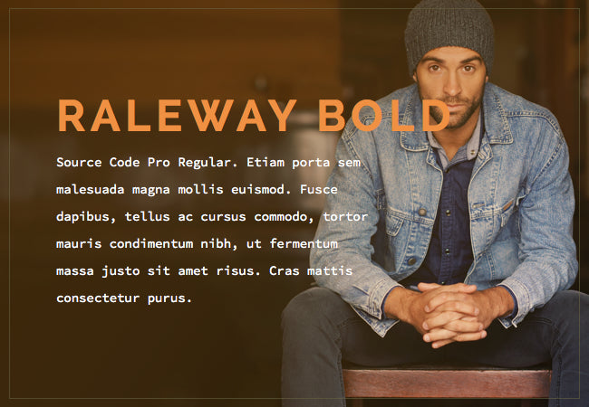
Masculinity and Style
To create a unique web font for your brand, you need to experiment. Try out different combinations of size, colour weight and classification and see what works. Play around with the contrasts and decide which particular mix and match of fonts suits your brand and target audience. The below example shows how the contrast in Raleway Bold and Source Code Pro Regular create a synergy that portrays timeless style with masculine features.
Don’t Make These Mistakes When Choosing a Font
Avoid getting too crazy with your fonts. Mixing and matching too many fonts and styles is harsh on the eyes and makes your text hard to read. It also distracts from the message you’re trying to get across. When it comes to fonts, less is often more. Here are some particular things to avoid:
1. Don’t mess with proportions
Anything that stretches, compresses, skews or otherwise manipulates the proportion of letters is not a good idea. Don’t try it!
2. Avoid using Comic Sans or Papyrus
Sadly, these two fonts have been heavily over-used and mis-used, so much so that they are now associated with unprofessionalism. The last thing you want is for your business to seem unsophisticated and inauthentic. Instead of Comic Sans give Flamenco, Ribeye Marrow, Autour One or Unkempt a try. Instead of Papyrus you can test out Fondamento, Quintessential or Crimson Text.
Need help?
At Elkfox we want to make sure that your Shopify store looks good and feels good. We’re here to support you if you need help to choose the right font and design for a beautiful and compelling online store.